01 / Templates
Pre-built page templates
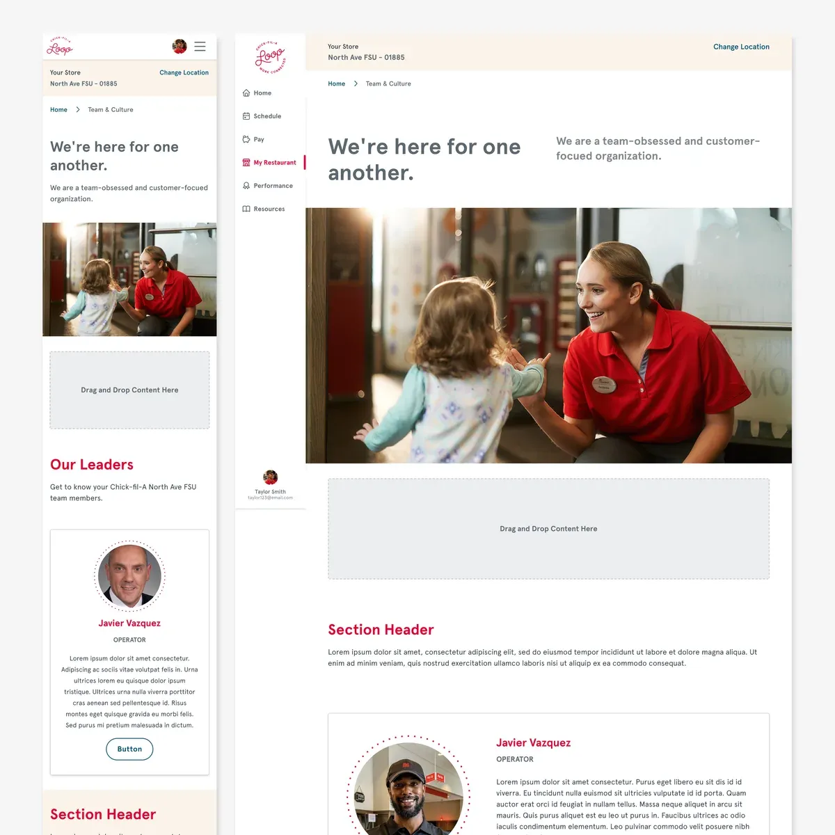
Authors pick a page type, like orientation, team or benefits, and get a complete layout. They swap in their own copy and photos; the structure is already done.
A modular site builder and component library that let franchise owners build on-brand employee portals without a designer, a developer, or a support ticket.
The problem
Every restaurant needed its own employee portal. The people building them run restaurants. They aren't web editors.
What I did
Led UX strategy and design for a brand-locked component library, and the authoring flows that make it fast to use.
The result
Operators publish polished pages on their own, and every one of them stays on-brand by default.
01 / CONTEXT
A national fast-food brand engaged Credera to build a modular site builder for its employee portals: the place team members complete orientation tasks, view team rosters, find benefits info and learn operational best practices.
The people building those pages were franchise owners, operators and managers: experts at running a restaurant, occasional visitors to a page editor.
Total freedom
The brand erodes.
Our target
Flexible content, fixed brand
Total control
Pages can't flex.
02 / APPROACH
Design for the least technical author
Our typical author wasn't technical. If they could build a polished page with minimal effort, everyone could.
Scale through recombination
Reusable components and templates flex to each restaurant's needs. New pages are assembled with existing components, not designed from scratch.
Make the brand impossible to break
Brand rules live inside the components, so authors never have to think about guidelines at all.
03 / SOLUTION
The real work was how people use it. Whether an author is starting a page from scratch or adding one section to an existing page, we designed more than one path to get it done.
01 / Templates
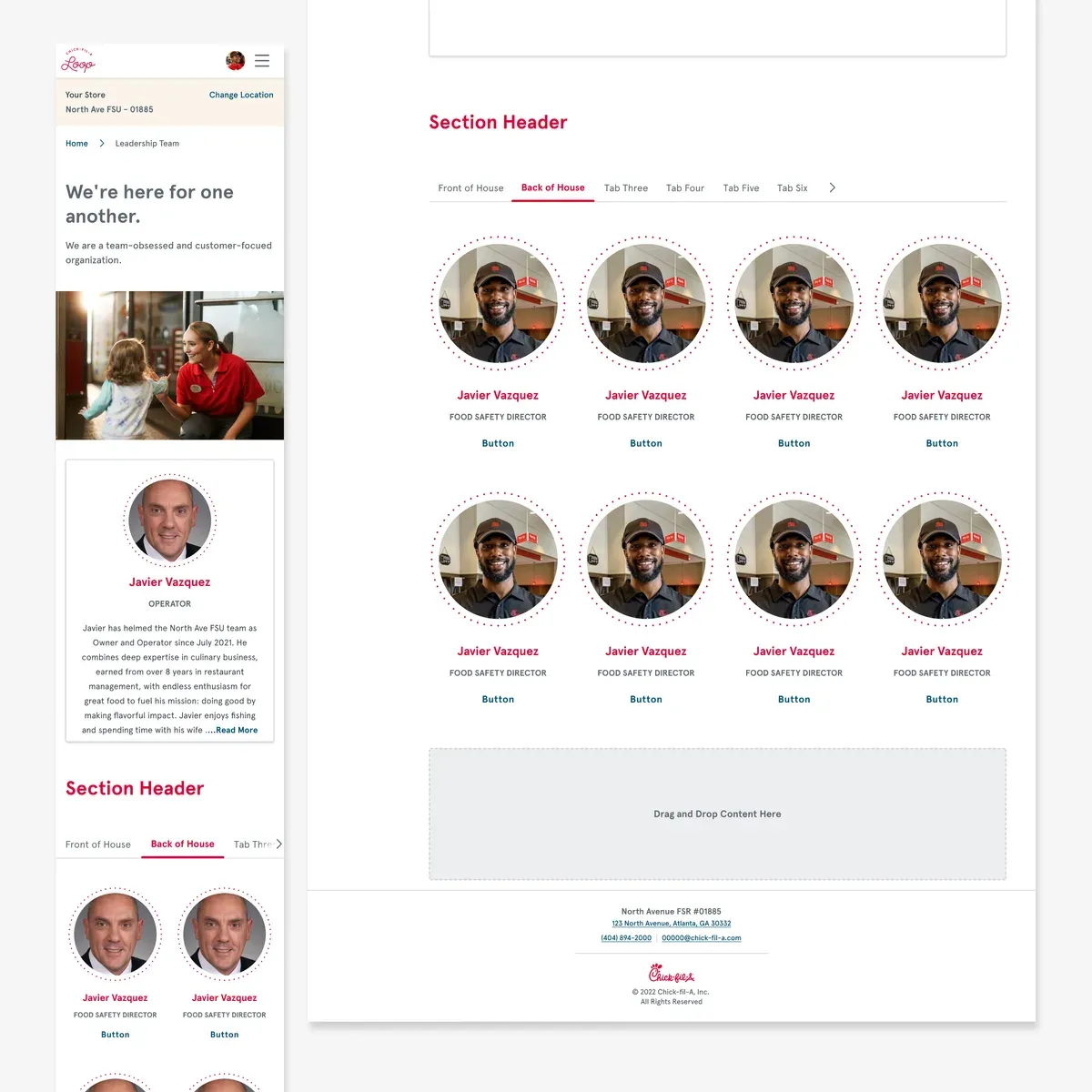
Authors pick a page type, like orientation, team or benefits, and get a complete layout. They swap in their own copy and photos; the structure is already done.
02 / Drag & drop
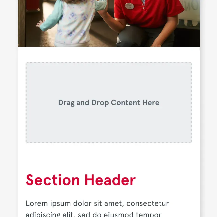
Sections are added, reordered and removed by dragging them into place. No code, and no layout decisions to get wrong.
03 / Components
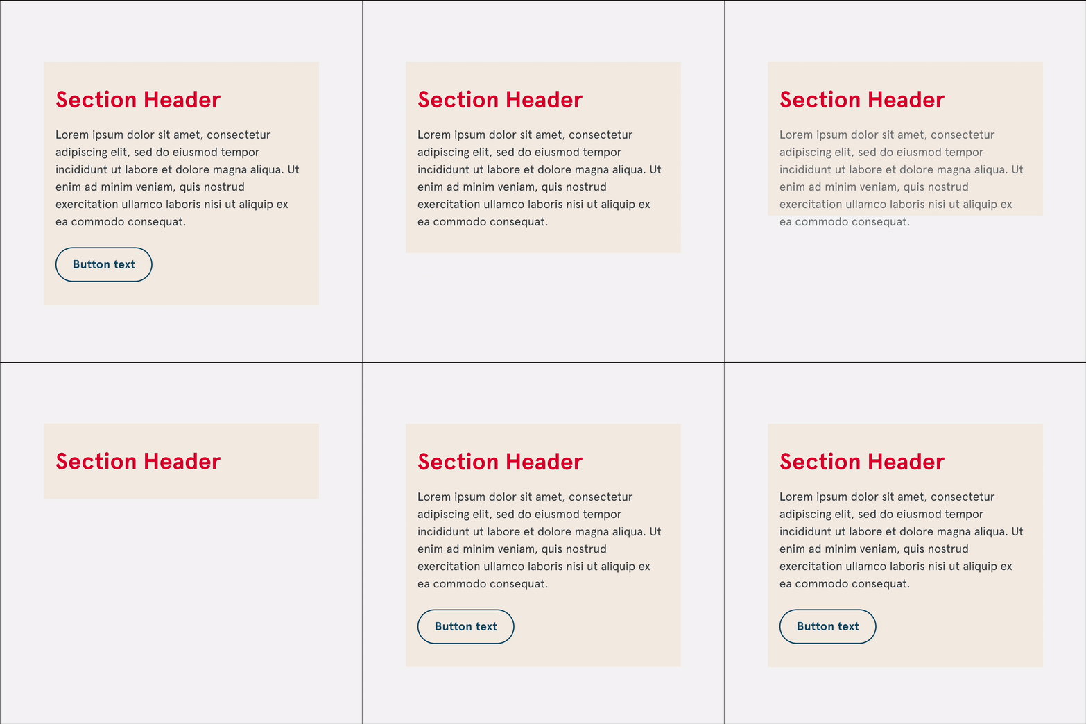
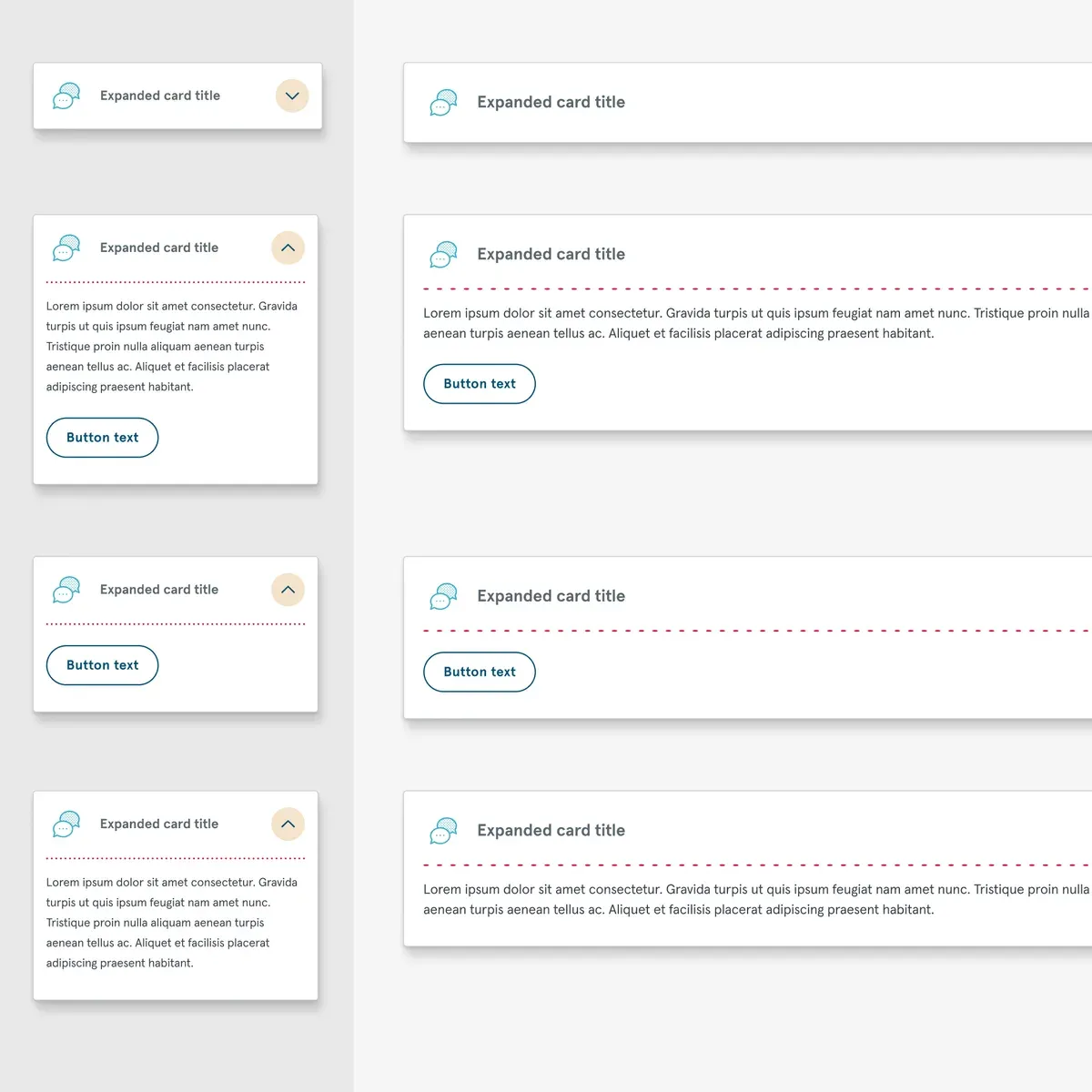
Each component exposes content options only: the text, the image, a button on or off. Type, color and spacing are fixed, so every page stays on-brand.
What shipped
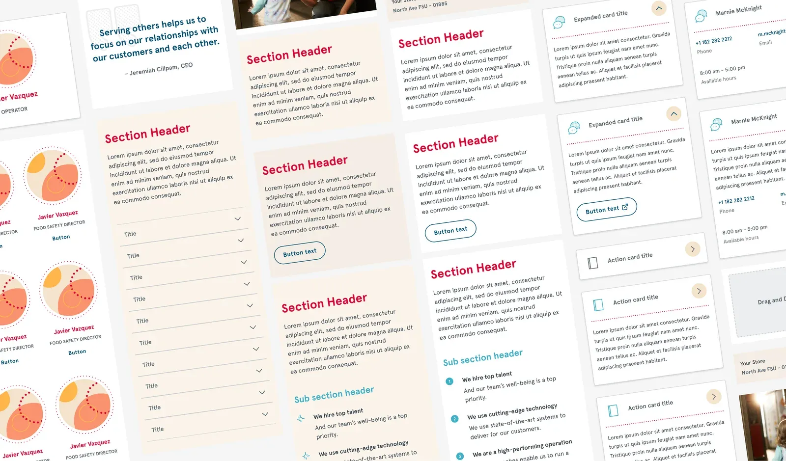
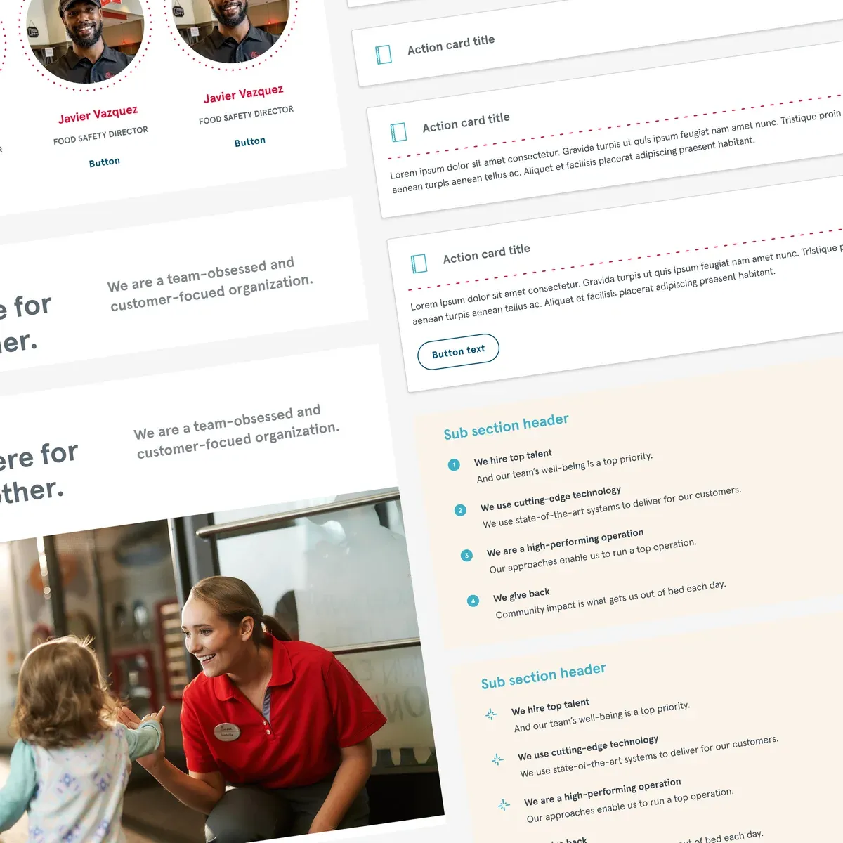
Below are more screenshots from the real system: every component documented in each of its states, and the pages operators built from those same parts.
04 / IMPACT
For operators
Publish without a ticket
Owners and managers create and update their own pages, instead of waiting on a central team or an agency.
For the brand
Consistent by default
Guidelines are built into every component, so each location's pages stay on-brand without anyone policing them.
For the business
One system that scales
New pages and new needs are met by recombining what exists, not by designing from scratch each time.
The takeaway
A design system only scales when the people using it never have to think about it.
A component library's value isn't the components. It's the authoring experience wrapped around them. Designing for the least technical author made the system faster for everyone, and turned brand consistency from a rule people follow into something the product guarantees.