Consolidating Step 1 and 2 of OUF
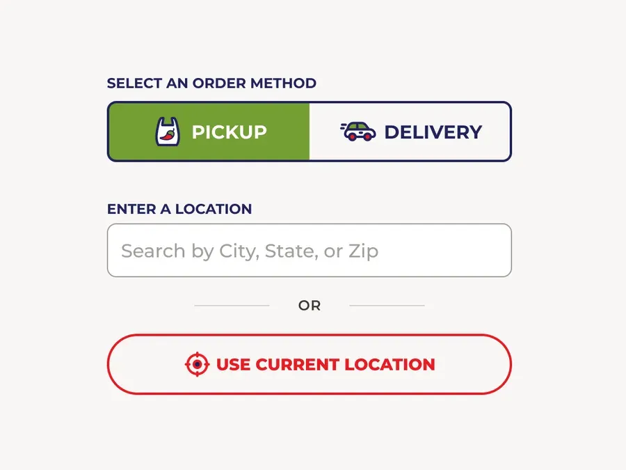
Selecting an order method and entering an address or zip code are heavily related to each other. A dynamic page that responds to the user's order method is a seamless way to reduce clicks and streamline OUF.
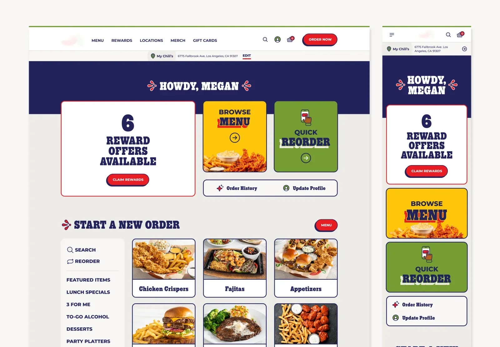
At Credera, we partnered with an international casual dining restaurant chain on a comprehensive 9-month project involving a website redesign and native app design. This effort included UX research, branding workshops, wireframes, high-fidelity designs and a design-to-development handoff.
Our redesign focused on two core components of the online ordering experience: the Order Up Front (OUF) flow and cart experience. By focusing on fundamental UX principles - reducing steps, simplifying choices, and creating clear paths to completion - we achieved significant improvements in both customer satisfaction and business metrics.
The most impactful changes aren't the most technically complex. The following examples demonstrate how removing friction from core interactions yielded these powerful results.
Feature 1
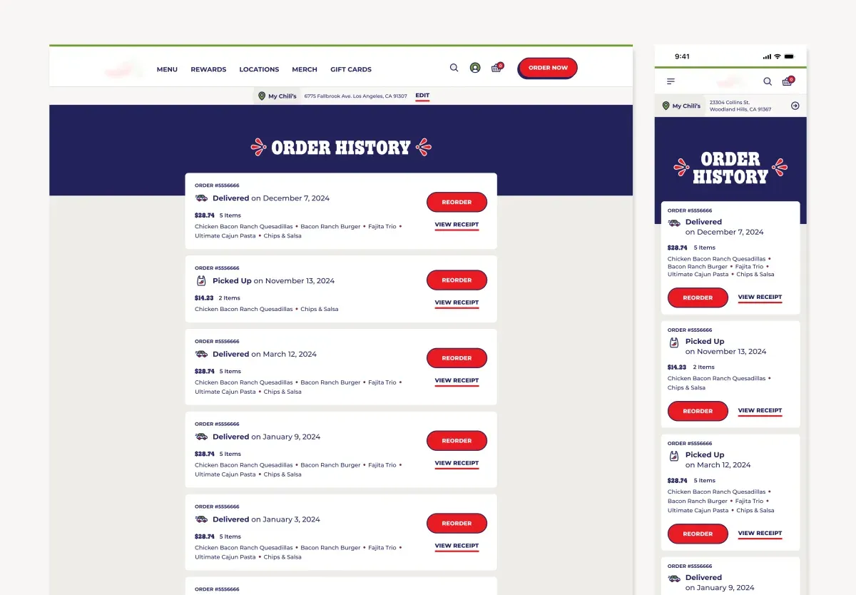
The OUF (Order Up Front) flow is a required flow for all users when ordering food online. The flow is designed to collect essential information from the user upfront. This includes selecting the order method, restaurant location, and the pickup or delivery time.
Selecting an order method and entering an address or zip code are heavily related to each other. A dynamic page that responds to the user's order method is a seamless way to reduce clicks and streamline OUF.
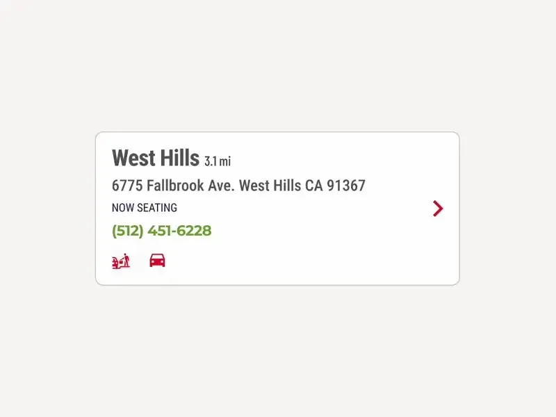
Some features added more friction than value to users. Two examples of this are the restaurant details on each restaurant location card and the "use current location" button for delivery orders.
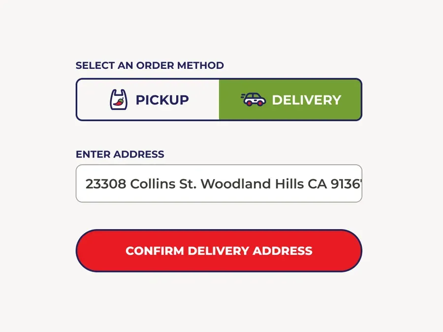
Minimizing the distance a user’s mouse or finger travels to click a button enhances the speed of interactions, reduces user effort, and makes the interface more intuitive and user-friendly.
Feature 2
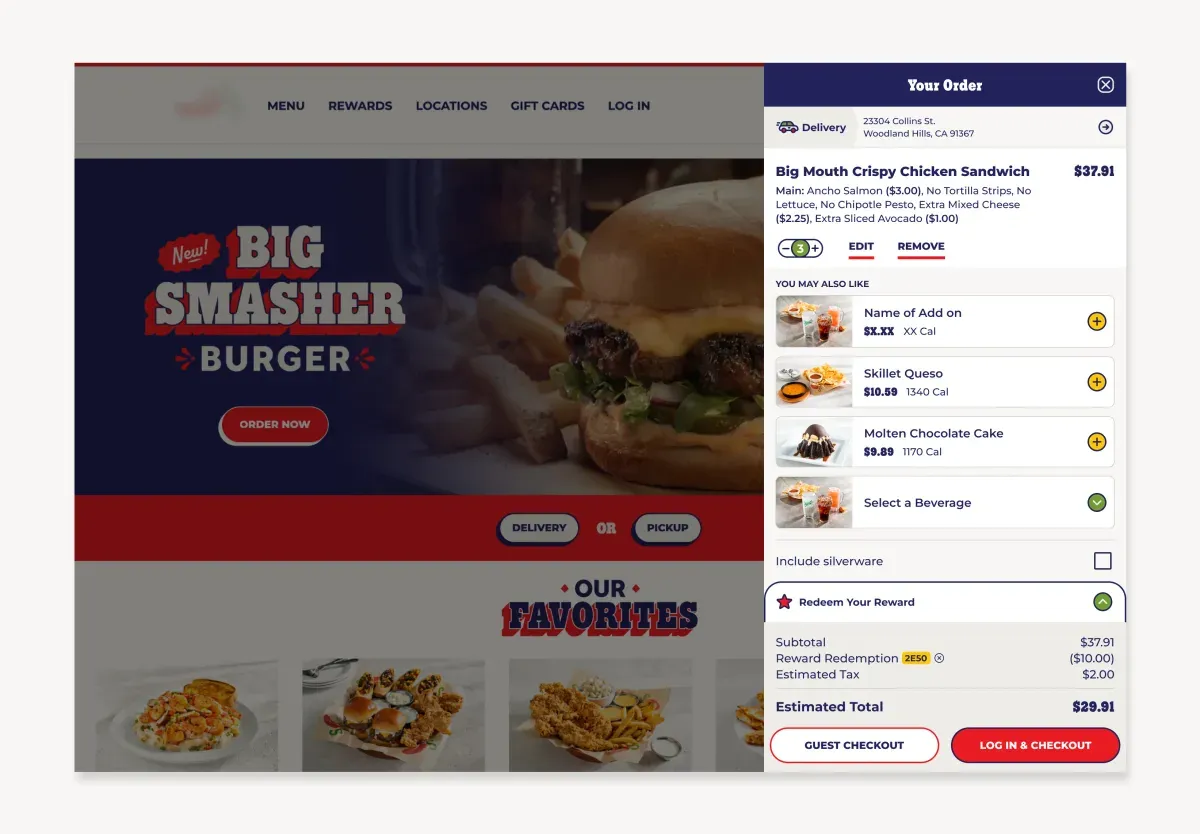
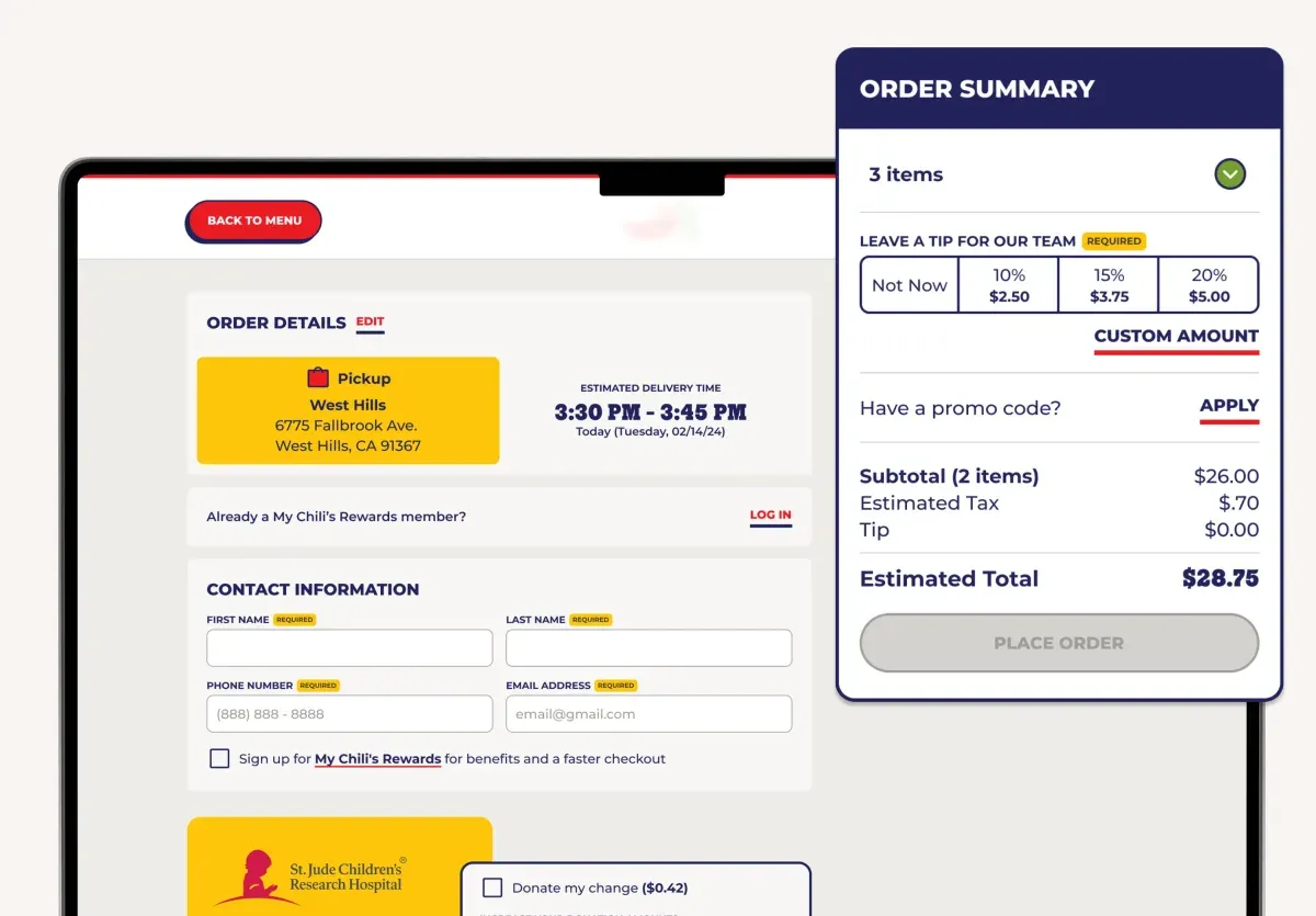
Based on results from user research, a competitor's analysis, and an analysis of industry standards, we redesigned the cart to be a seamless and additive experience during all stages of the online experience.
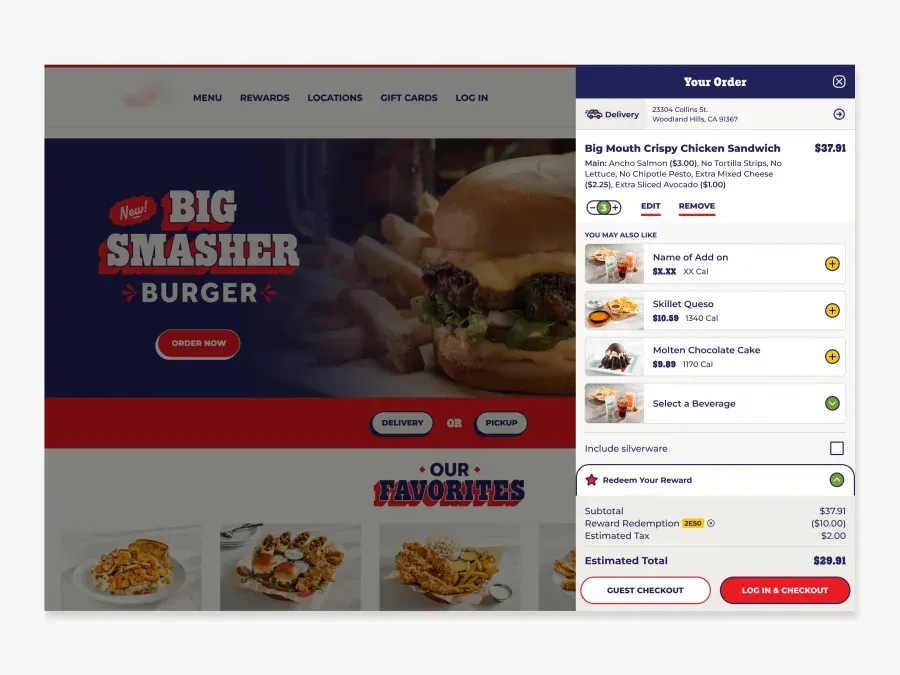
This solved the most common user complaint of losing their place when engaging with the cart. By evolving the cart into a drawer, users can seamlessly engage with their cart without being pulled away from their flow.
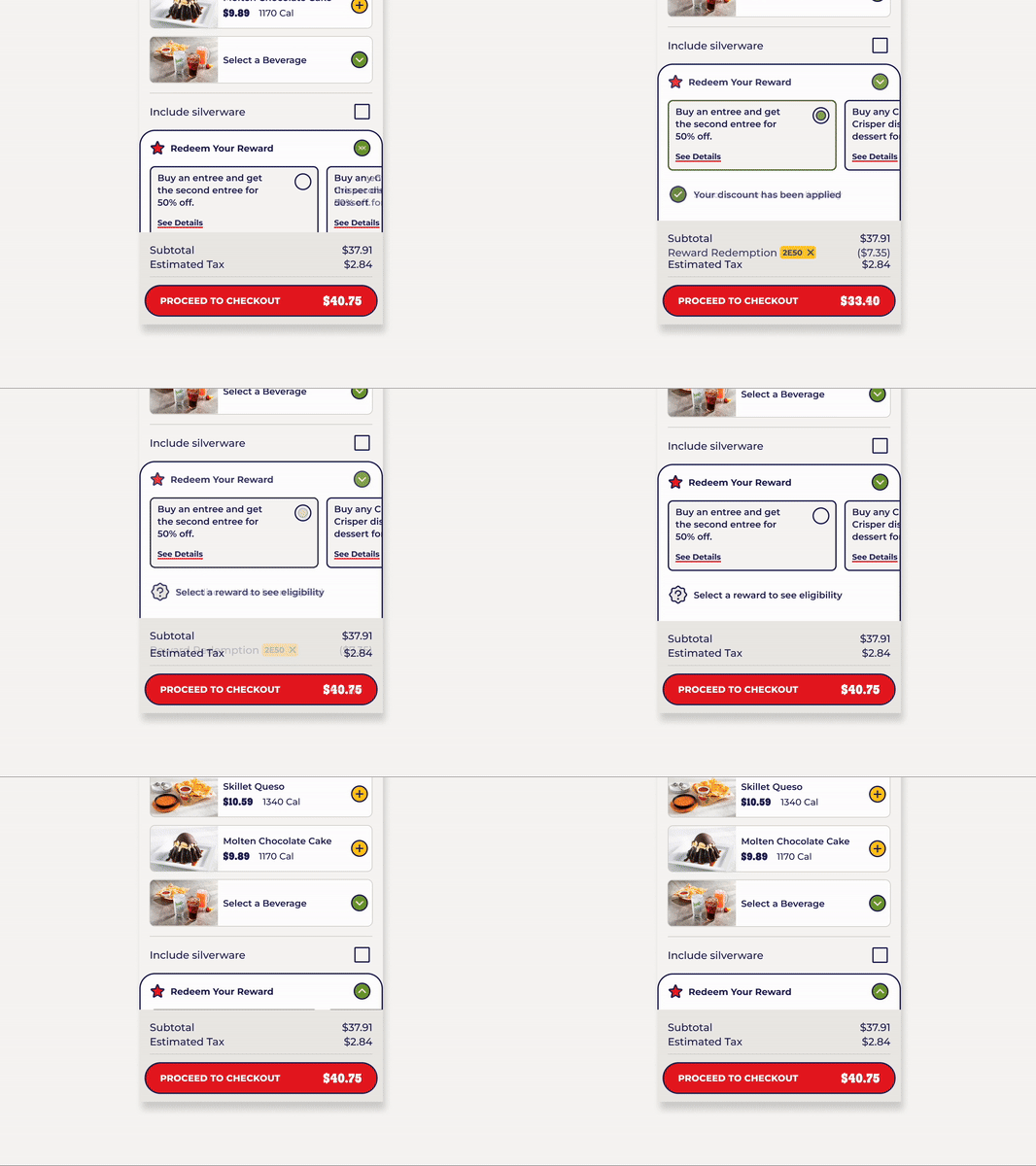
Users want to see available rewards directly in cart so they can maximize savings and make informed purchasing decisions. This visibility promotes reward usage, enhances customer satisfaction, and boosts loyalty to the service.
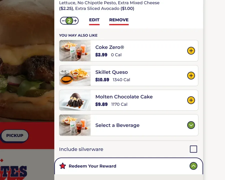
User feedback suggests users actually desire a personalized upsell experience when it aligns with their preferences, recommending relevant products. This tailored approach leads to high spending and introduces users to new menu items.
There can be overwhelming pressure from leadership and stakeholders to reinvent the wheel when in reality, the most profound change you can make is simply listening to the users and adopting UX best practices. If there’s anything you take away from this project, it is the importance of embracing UX best practices no matter how commonplace and elementary it may feel.
$25m
Annual Revenue from Upsell Integration
-40%
Change in Click Count to Edit OUF
+11%
Average Order Total
+36%
Change in Rewards Engagement
Here are a few highlights from this project. Thanks to an incredible team of researchers, designers, and developers, we were able to elevate a national casual dining restaurant's brand and user experience.