Redesigning front-line restaurant operations
Redesigning the iOS handheld that over 50,000 Brinker team members use to take orders in restaurants every day.
- Role
- UX StrategyUX ResearchUX DesignUI Design
- Duration
- 3 months
The problem
Team members had limited confidence in the TMH, and frequently abandoned it for the POS.
What I did
As lead designer, I owned the redesign end to end: UX strategy, design, and testing every version from wireframes to clickable prototypes, working closely with a UX researcher throughout.
The result
Tap count on key tasks dropped 52%, and the feedback was overwhelmingly positive.
01 / CONTEXT
Redesigning the ordering app used by 50,000 team members
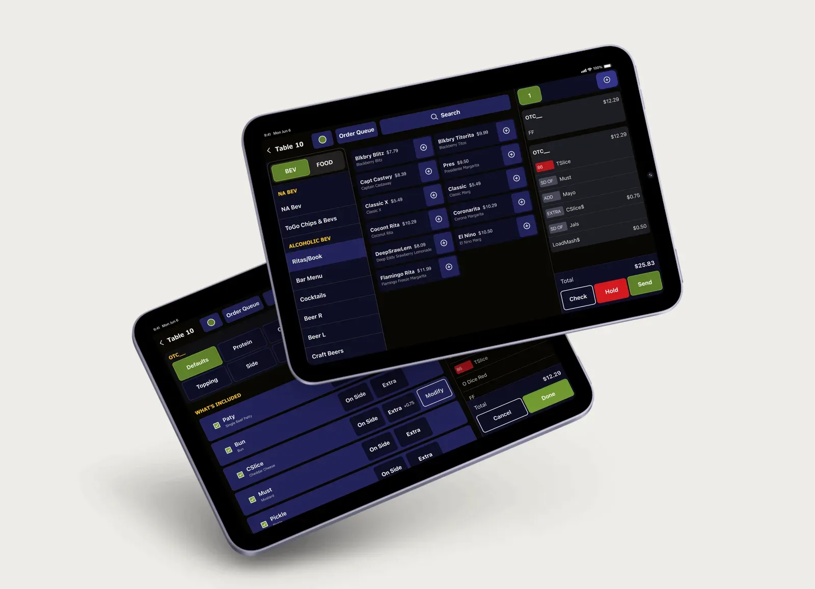
Brinker partnered with Credera to redesign the iOS native app that over 50,000 team members use to take orders in restaurants daily. The project spanned 12+ weeks and involved deep collaboration between research and design teams.
With 50,000 daily users depending on this product, it was crucial that the final design be intuitive and roll out smoothly across the entire user base. We consistently heard three specific points of feedback from team members that revealed their limited confidence in the current TMH.
- 01
Team members didn't know what ingredients belonged in certain items.
“I have no clue what ingredients go in this Margarita, how am I supposed to answer the guest’s question and modify correctly? I feel bad having to annoy the bartender.”
- 02
There was no standardized approach for charging for added sides or ingredients.
The current TMH left pricing decisions up to individual team members' discretion. One server might charge for extra ranch while another gave it away. Team members created their own rules, causing operational chaos.
- 03
Team members frequently abandoned the TMH for the POS.
Due to negative experiences with the TMH, team members avoided certain features entirely. Instead, they would log out of the TMH, walk to the POS terminal, log in, and complete their tasks there.
02 / APPROACH
Our goal: help team members take orders with confidence and ease
The core focus of the TMH redesign was to make the product more intuitive for team members, taking orders with confidence and ease. By simplifying the visual design and clarifying item structures, we aimed to reduce confusion and help team members navigate the system more naturally.
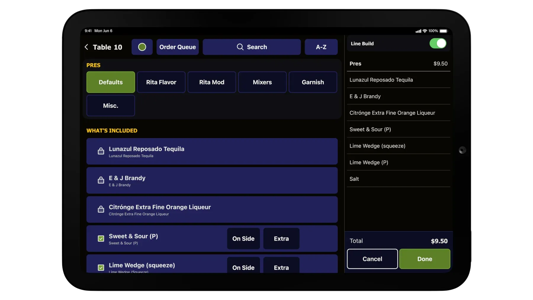
We prioritized features that empowered staff to become true menu experts, surfacing essential details like forced modifiers and line builds at just the right moment. Streamlining flows like split checks also contributed to smoother, more efficient interactions.
Success was measured by how quickly new team members could ramp up and graduate from a trainee to veteran employee, how naturally conversations with customers flowed during order-taking, and how few taps it took to complete a task.
Our process
The design process was highly collaborative between research and design teams from start to finish. Early in the project, our research team conducted user interviews and identified over 72 pain points based on team member feedback. These pain points were organized into broader themes that guided our iterative design process.
We tested every version of our design, from wireframes to high-fidelity designs and clickable prototypes, with both the operations team and team members at various restaurant locations.
Each screen went through 4 iterations and 3 validation cycles. In total, we conducted 53 testing sessions, working with 5 operations team members and 42 team members across 14 different restaurant locations.
03 / SOLUTION
Simpler visuals, clearer items, fewer taps.
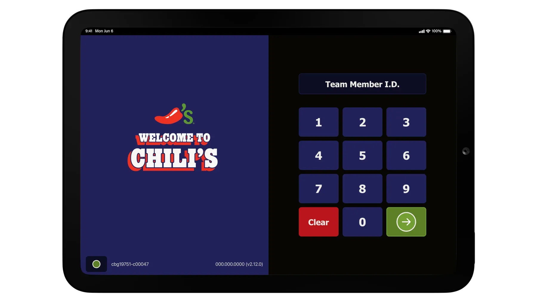
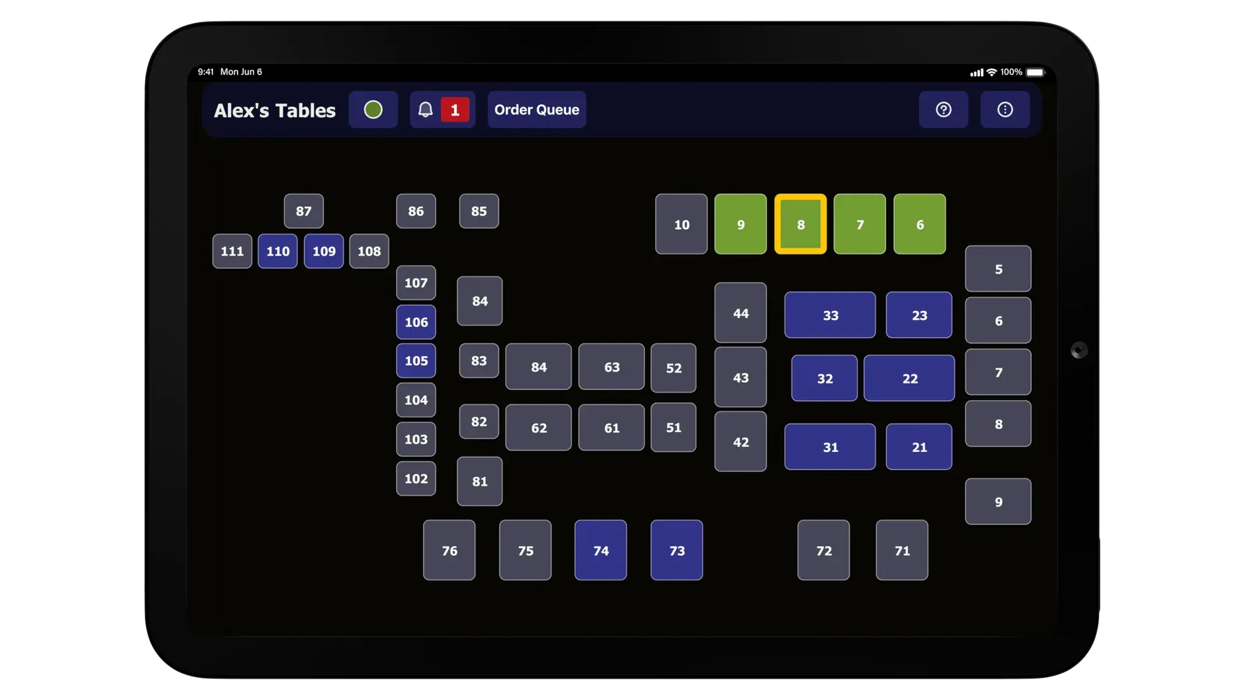
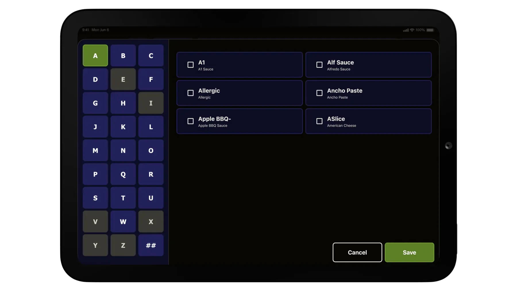
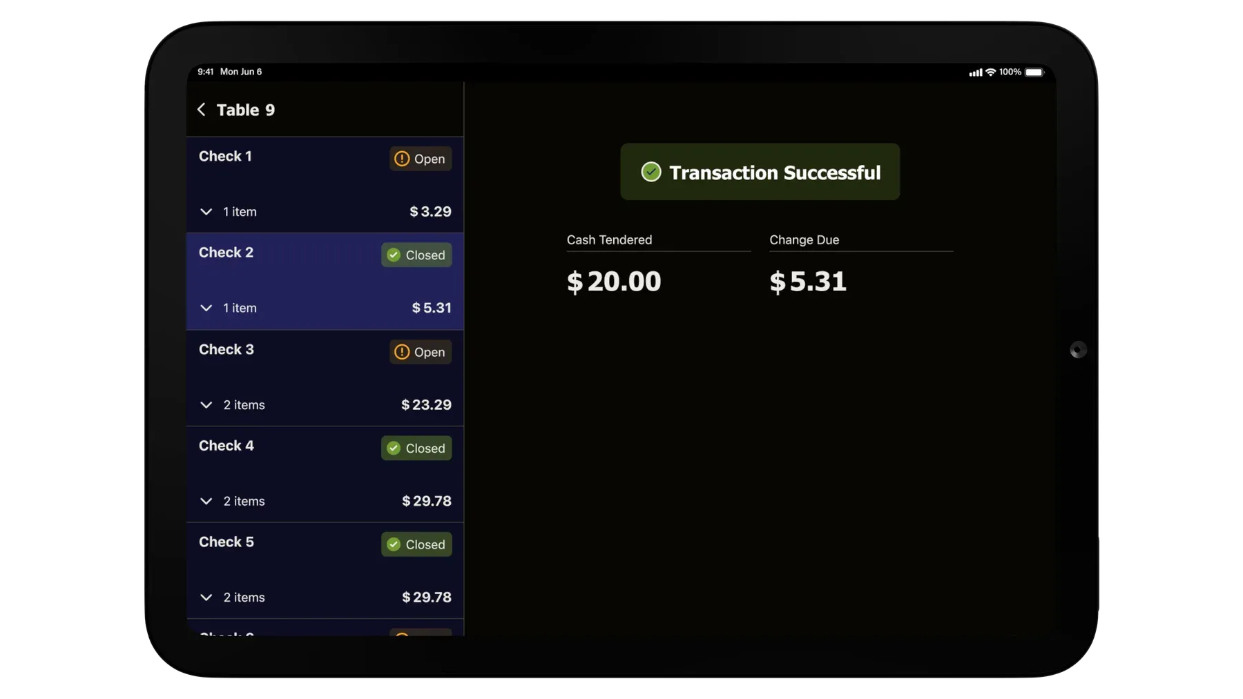
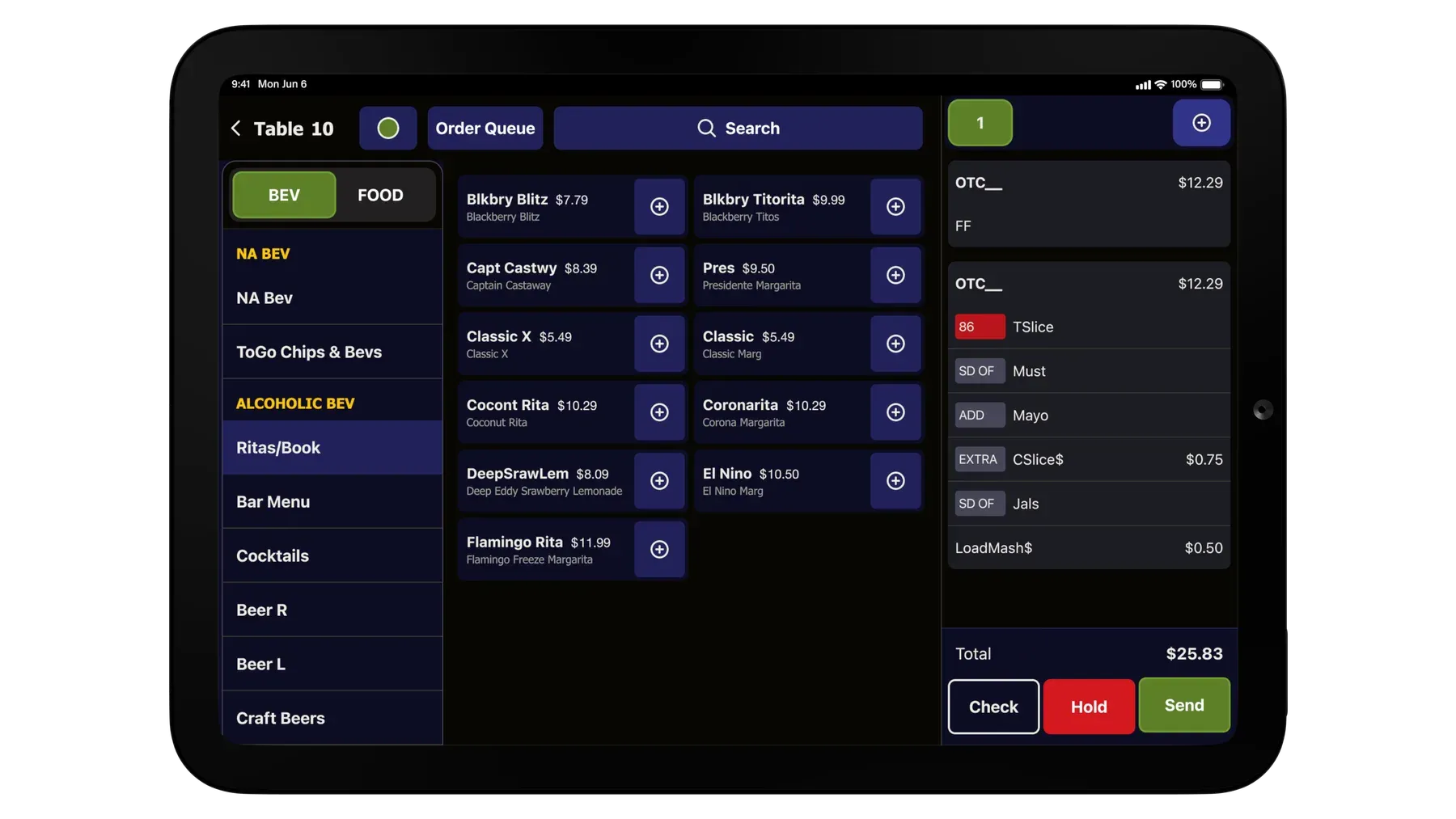
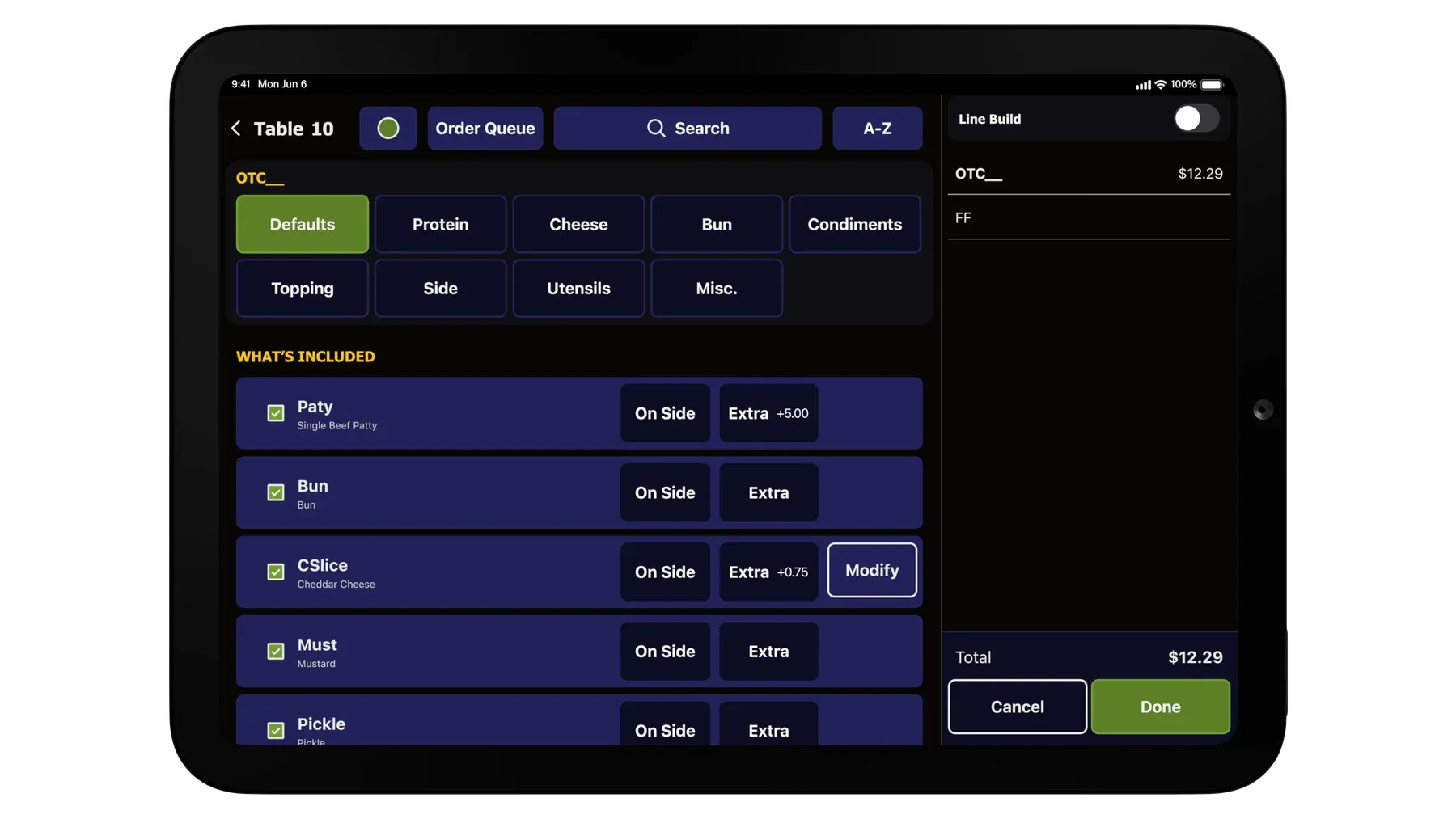
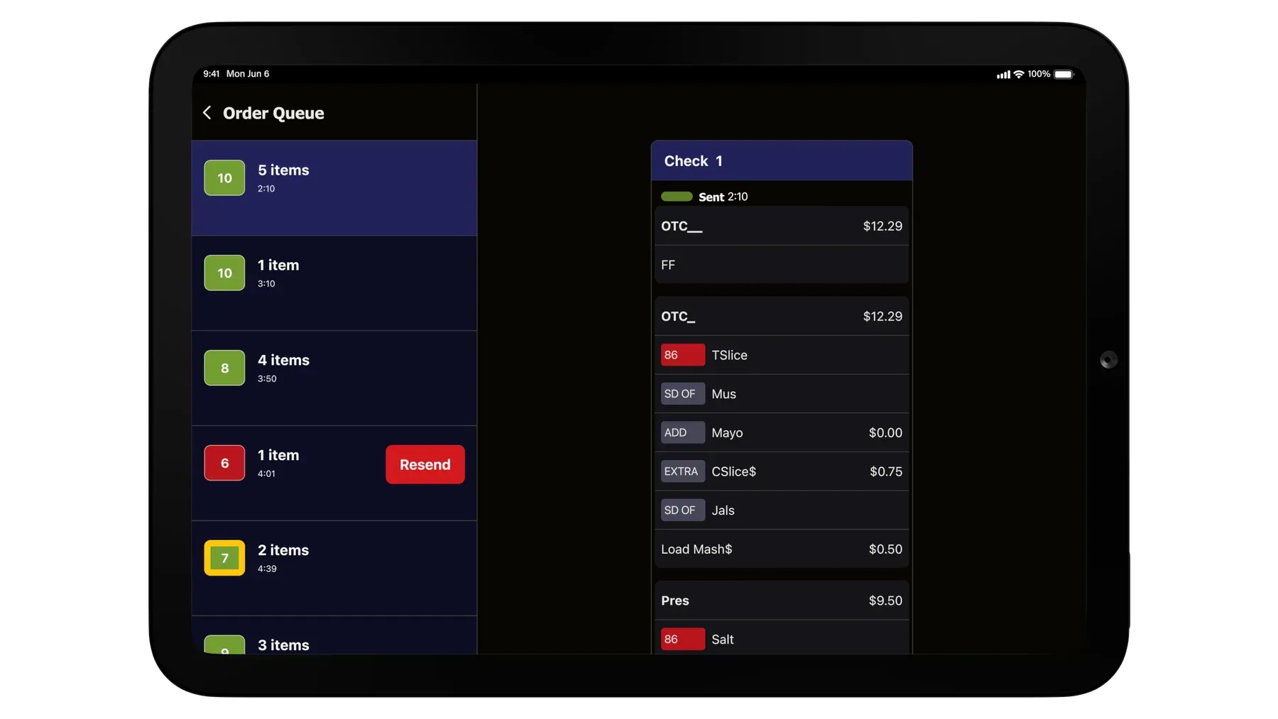
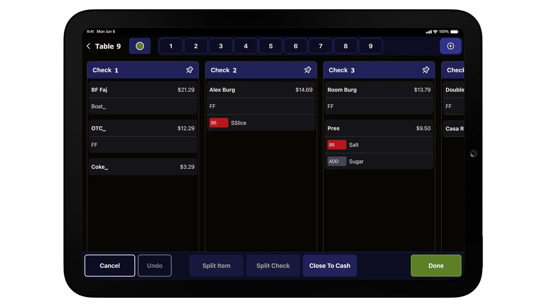
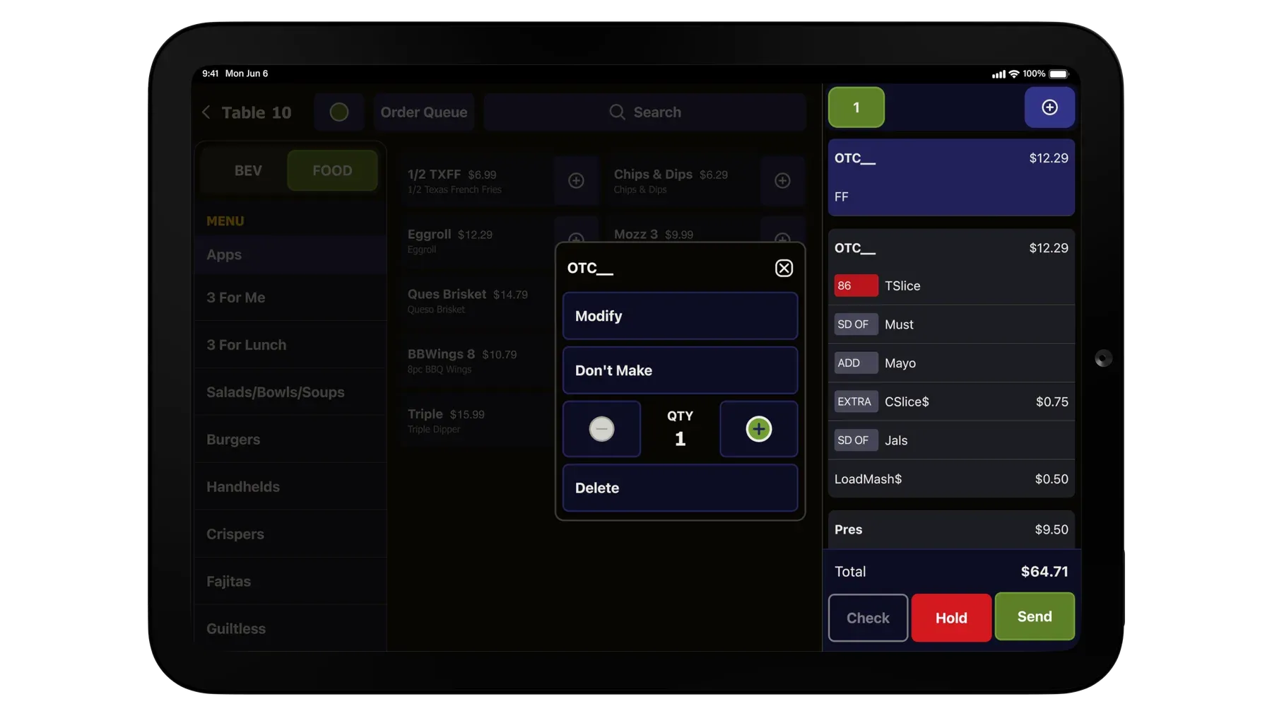
The designs were extensively tested and refined throughout the design process. Below are screenshots of the final product in development.
04 / IMPACT
The results exceeded all expectations
The new TMH designs received overwhelmingly positive feedback during our final testing session. The overall tap count for routine tasks decreased significantly, but it was the team members' enthusiastic responses that truly demonstrated the impact of these design enhancements.
Improvement in tap count
Fewer taps on key tasks
52%
166 → 100 taps
Adding an item with defaults
66%
Removing a modifier from the TLP
40%
Adding an extra of a modifier from the TLP
40%
Modifying a modifier from the check
56%
Moving an item to a new check
60%
Quotes from user testing
“I love it! It’s just faster, it’s more efficient. It’s easier to use than the one we have now. There’s a lot of functions that are in the back of my head while I’m serving that I think would be cool to add, and many of those are here in what I saw today. When are we getting it?!”
“The TMH re-design is fantastic, modern and simpler. TMs training on this new version will find it so much easier. It’s going to make it easier for them to figure out how to ring in their drinks properly, and it’s going to make interacting with guests and getting everything done quickly much easier.”
“As somebody who typically doesn’t like to use the iPads, I would be more inclined to have an iPad on me. This is a simpler system for people who aren’t so technologically advanced. Everything is more laid out for you. It feels clearer. Overall legibility and accessibility is better, it’s more user friendly.”
“I like that you can do a lot more with this setup than the last one. I love it. It’s so much easier. I have a team member who really struggles with the handheld, and I think this will help her tremendously. This design could cut down training shifts in general to 2 or 3 days.”